
Rescuing Leftover Cuisine
Brand identity design
2020 • Rescuing Leftover Cuisine
A modern brand identity for a New York City-based nonprofit working to fight hunger and reduce waste

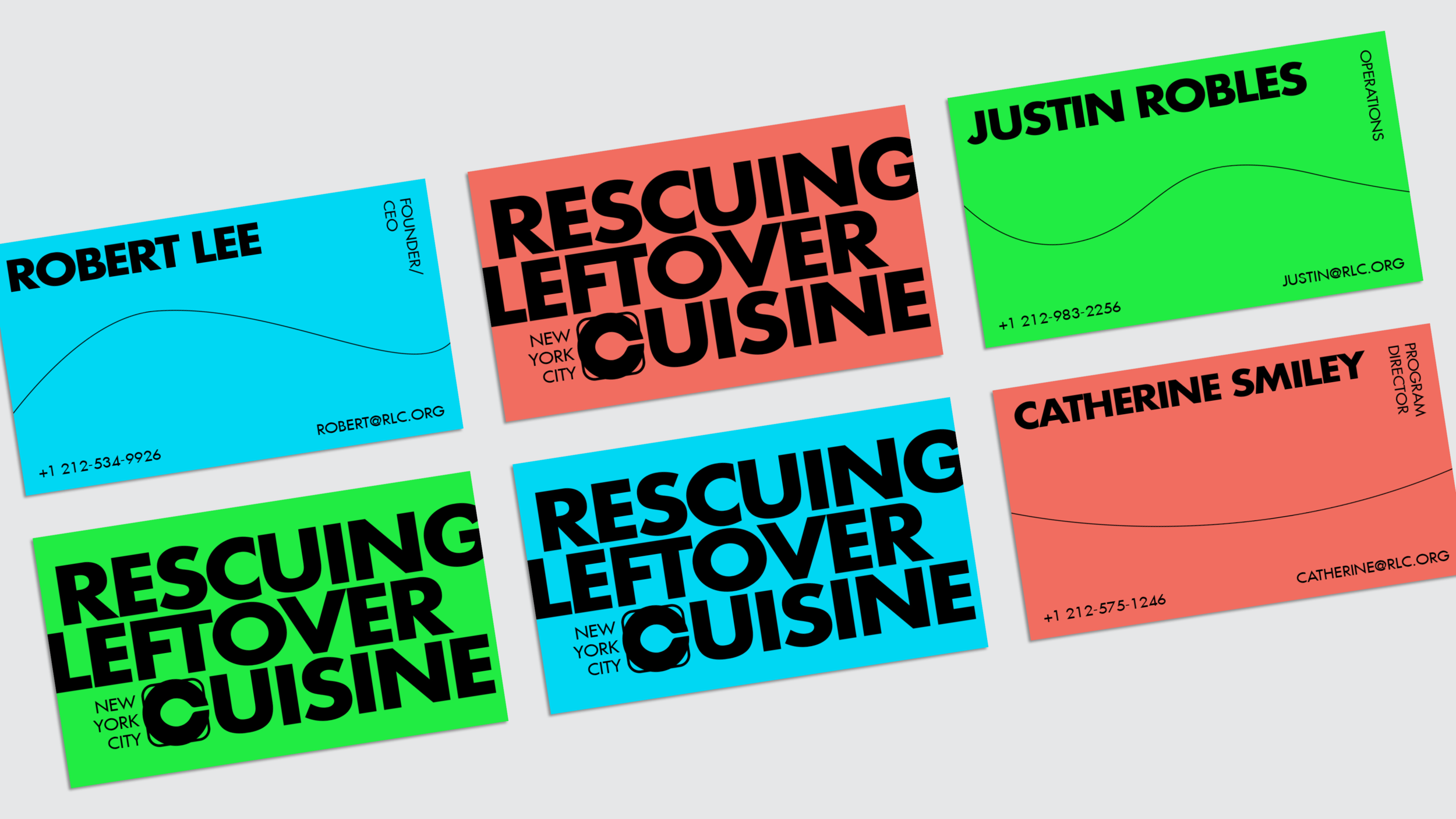
The new identity preserves two motifs that were central to the Rescuing Leftover Cuisine brand: the color teal, and the lifesaver symbol. The new logo utilizes the lifesaver by incorporating a spoon in the negative space, creating the appearance of the letter “C.”

The color palette was expanded to allow for red and green, two colors we associate with food. In the above business card design, the “lifeline” becomes a design tool that both breaks up white space and “connects” to the lifesaver theme.

